CSS Layout 101
This post will introduce the modern CSS layout modes, including flexbox, multi-columns, and grid.
Flexbox
Nowadays, flex layout is widely used to implement both the basic and complex layout in the morden web applications. Instead of block layout, flexbox allows us to
- specify which direction to layout the content (
flex-direction) - rearrange the display order of flex items (
order) - utilize the extra space to adjust the size of flex items (
flex) - specify the way in which flex items are aligned (
justify-content)
If you want to implement a two-column layout, you simply declare the following statement,
<div class="item">
  <div class="left">left side</div>
	<div class="right">right content</div>
</div>

.item {
	display: flex;
}
However, without flex, the alternate way to achieve this is to use float or position
.left {
	float: left;
}
.right {
	overflow: hidden;
}
Flexibility
It’s not common to change the property flex, but it’s very useful if we understand how it works. flex is composed of three parts:
flex-growflex-shrinkflex-basis
When omitted, the default value of flex-grow and flex-shrink is 1. However, the values are quite confusing in some cases. To clarify it, I make a table shown below. Unfortunately, we have to remember them.
| Case | Value |
|---|---|
| Initial | flex: 0 1 auto; |
| None | flex: 0 0 auto; |
| Auto | flex: 1 1 auto; |
| Number | flex: Number 1 0; |
I really love the last one flex: <number> because it can implement the even-spaced layout easily. For example, we can implement a dynamic ruler ( I mean when the ruler width is fixed, the width of major and minor scales are flexible when we increase or decrease the number of major scales or minor scales).
<div class="ruler">
  <div class="major">
    <div class="minor"></div>
    <div class="minor"></div>
    <div class="minor"></div>
  </div>
   <div class="major">
    <div class="minor"></div>
    <div class="minor"></div>
    <div class="minor"></div>
  </div>
</div>


.ruler {
  display: flex;
  width: 240px;

	height: 10px;
  background: #ccc;
}
.major {
  flex: 1;
  display: flex;
  border-left: 1px solid #f00;
}
.major:last-child {
  border-right: 1px solid #f00;
}
.minor {
  flex: 1;
  height: 6px;
  border-right: 1px solid blue;
  box-sizing: border-box;
}
.minor:last-child {
  border-right: none;
}

Order
By default, flex items are displayed in the same order as they appear in HTML. Sometimes we may want to change the display order without modifying the HTML structure. For example, to swap the above HTML to put the image on the right, we simply declare
.right {
	order: -1;
}
// or
.left {
  order: 1;
}
Why it works?
- The default value of
orderis0, which means all flex items have the order of0. Thus, the display order is determined by the order of appearing in HTML. ordertakes an integer value, and items with the smaller order are displayed first.
Auto Margin
This is my favorite trick. Simply put, setting an auto margin on one flex item will push it away from other elements. One common scenario is to put the login module at the right side of a header, as shown below,
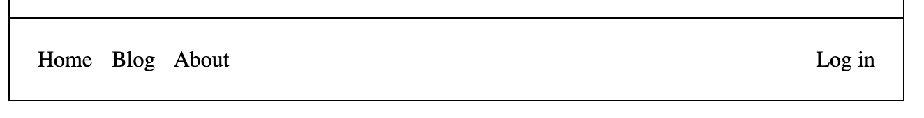
<div class="item">
  <nav class="nav">
    <span>Home</span>
    <span>Blog</span>
    <span>About</span>
  </nav>

  <div class="login">
    Log in
  </div>
</div>

.item {
	display: flex;
}
.login {
  margin-left: auto;
}
We can see that justify-content or align-self are ignored when extra space are available for auto margins. Besides, overflow containers will ignore the auto magins and overflow in the end direction, as shown below.
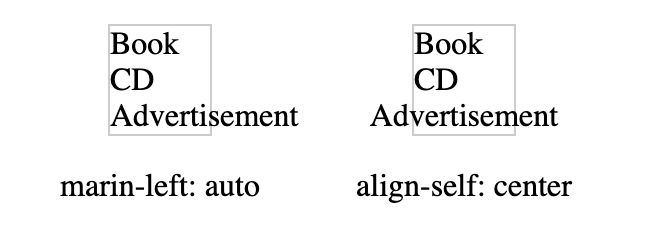
<div class="flex-column">
  <div>Book</div>
  <div>CD</div>
  <div class="ad">Advertisement</div>
</div>

.flex-column {
  border: 1px solid #ccc;
  width: 50px;
  margin: 0 50px 0 50px;

  display: flex;
  flex-direction: column;
}
.ad {
  align-self: center;
}
.ad {
  margin-left: auto;
}
Absolute Pos
An absolute-positioned flex item has the following characteristics
- it’s out of flow,
- it seems that it were the sole item in that container; it means that even though we have more than one absolute-positioned flex item, they are independent with each other
- Both the absolute-positioned flex item and the flex container are fixed-size boxes, so we cannot change their width or height. In other words,
stretchwill have no effect on them.
<div class="item">
  <div class="left">left</div>
	<div class="content">content....</div>
  <div class="right">right</div>
</div>

.item {
	display: flex;
  justify-content: flex-start;

  border: 1px solid #000;
  width: 600px;
  padding: 20px;
  height: 100px;
}

.left {
  background: #f00;
  width: 200px;
}
.content {
  background: #0ff;
  position: absolute;
/*   align-self: center; */
}
.right {
  background: #00f;
}
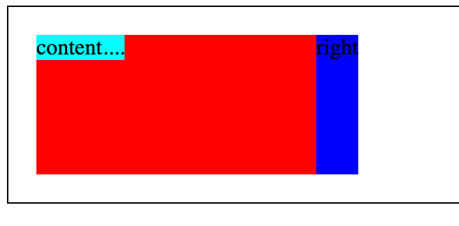
From the above figure, we see that the absolute-positioned item is out of flow and is considered as the sole item in that flex container. Since justify-content is specified as flex-start, the content area is placed at the start of the main axis. If we modify it to center, it will be placed in the center of the main axis.
On the other hand, the default value of align-items is stretch, but it has no effect on the abs-positioned flex item. Instead, if we specify align-self: center, we can see it’s centered.
Since there are some unexpected and confusing behaviors, it’s recommended that we should avoid writing code like this.