An E2E Project - EDA
So far, we have discussed many algorithms, such as linear regression and ensemble methods. It’s time to learn how to build a real machine learning project to enhance our understanding of these models.
Overview
The book “Hands-on Machine Learning” has summarised the below 7 steps as a guidance to do an end-to-end machine learning project,
- Frame the problem
- Get the data
- Explore the data
- Prepapre the data
- Explore many different models
- Fine-tune the model
- Deploy the system
In this post, we will cover the first 3 parts. The complete code can be found here.
Frame the problem
The first step is to define you problem. People are unlikely to do things without reasons, right? So ask yourself, what problem do you want to solve? Why are you interested in them? What’s your objective? Are there any solutions out there?
As an example, we are going to predict used car prices because accurate prices prediction can help both buyers and sellers. For buyers, it can ensure the money that customers invest on used cars to be worthy. For used car dealers, they might want to know which factors influence car prices most so as to adjust sales strategy and offer a better prediction to customers. Therefore, there is a necessity for building a used car price prediction system.
Get the data
There are many ways to get the desired data. You can write a web crawler to download the data from related websites or you can get data freely from some public data platforms. Among them, Kaggle is one of the most popular data platforms. In this toy project, the data is downloaded from Used Cars Dataset - Kaggle.
!kaggle datasets download -d austinreese/craigslist-carstrucks-data -p data

!unzip data/craigslist-carstrucks-data.zip -d data
Explore the data
Exploring the data or EDA is the very first and important step when doing a machine learning project. The goal of EDA is to get insights from the data so as to clean and prepare data for building models. Generally, it involves the following steps,
- Identify variables
- Examine data quality
- Univariate analysis
- Bivariate analysis
Identify variables
After getting data, we should have a peek at data first. Specifically, we need to answer the following questions,
-
How many observations and variables do we have?
-
What variables are your predictors and target?
-
How about data types and memory usage?
-
What’s the descriptive statistics about data?
Luckily, Pandas provides convenient functions to answer these questions.
df_vehicles.shape

df_vehicles.info()

df_vehicles.describe()

df_vehicles.head()
The following tables shows the distribution of data types and some toy data.
| Data Type | Variable Name |
|---|---|
| Numerical (6) | id, year, price, odometer, lat, long |
| Object (19) | url, image_url, region_url, manufacturer, model, condition, cylinders, fuel, title_status, transmission, drive, type, paint_color, region, state, posting_date, description, size, VIN |

Comments:
- There are 426,880 rows and 25 attributes.
- The variable
priceis our target variable and the remaining are our predictors. id,url,region_url,image_url,post_date, andVINhave nothing to do with car prices. Thus, we need to remove them.- There are numerous categorical variables plus 6 numerical variables.
Examine data quality
The raw data is unlikely to use directly because it’s inevitable to introduce errors like duplication, null values or extreme values when collecting data. The higher the data quality is, the better model’s performance is. So we need to identify and solve these problems to obtain a clean data set. Below are some common techniques to check whether we have redundant data, missing values or outliers.
1) duplication
# return true if we have duplicate rows
df.duplicated()

# remove the duplicated rows, keep the first row by default
df.drop_duplicates()
Fortunately, there are no duplicated rows. But it depends.
2) missing value
Heatmap enables us to identify the distribution of missing values visually.
sns.heatmap(df.isna())
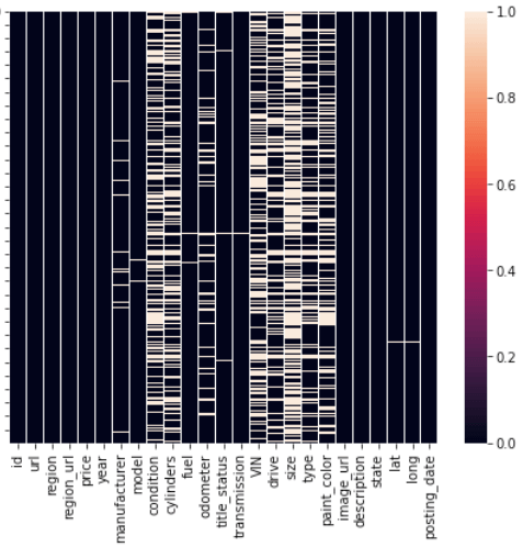
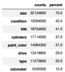
Figure 1 shows that size, condition, VIN, cylinders, drive and paint_color have a significant number of null values. To quantify the number of missing values, we can use a table shown below.
3) outlier
In the previous post Descriptive Statistics, we talked about the descriptive statistics like mean, variance, and range. These values can be obtained easily using the following code,
df_vehicles.describe()

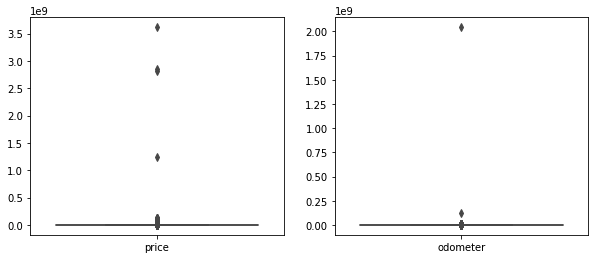
From above table, we can see that the lowest car price is 0 while the highest car price is up to 3,600,000,000. The mean of the car prices is greater than the median, which means the distribution of prices is not symmetrical and there are abnormal values in prices. And the same goes for odometer. To verify our belief further, we can plot boxplots for year and odometer shown in Figure 2.
Okay, let’s put it all together. From the above initial examination, we can conclude that,
- There are 426,880 rows and 25 attributes in our data set, and
priceis our target variable. - A great deal of categorical variables need to be encoded.
- There are no redundant rows.
- There are some useless columns to be dropped, such as
url,image_url,region_url,id,post_date, andVIN. - Nearly all features contain a great deal of missing values. We can remove features directly or find ways to impute them.
priceandodometerhave extreme values.
Univariate analysis
In univariate analysis, we will look at variables one by one. The statistics and visualization methods depend on the data types. Typically, we divide data into 2 types: numerical variable and categorical variable.
1) numerical variables
For numerical variables, we measure the central tendency and dispersion of the data, which are discussed earlier. To visualize data, we can use histogram, boxplot, or other suitable charts. You might find that this is also exactly what we did before for detecting missing values and outliers.
| measurement | statistics |
|---|---|
| central tendency | mean, median, mode |
| dispersion | range, quantile, variance, skewness |
| visualization | histogram, boxplot, bar chart |
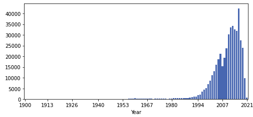
For example, Figure 3 shows the distribution of the variable year. It can be seen that most cars were made after 2000. Besides, this distribution has a long left tail, which means the mean is lower than the median. From Figure 4, we can find that the mean is 2010 while the median is 2013. This is because the feature year contains some extreme small values.
2) categorical variables
For categorical variables, we usually plot bar charts to understand the distribution of each category, as shown in Figure 4.

Bivariate analysis
Analyzing one predictor seems a bit monotonous. In fact, we are more interested in the relationships between predictors and our goal. Generally speaking, we can do conduct an analysis
- between numerical and numerical
- between numerical and categorical
- between categorical and categorical
1) numerical vs numerical
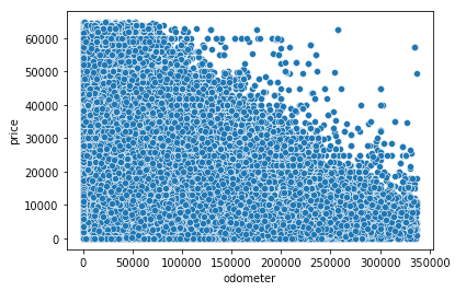
Scatter plots provide a nice way to find the relationships between continuous variables. It’s easy to plot them with the help of seaborn. From Figure 5, we can see that there is a negative relationship between odometer and car prices, which means the car prices will decrease as the odometer increases.
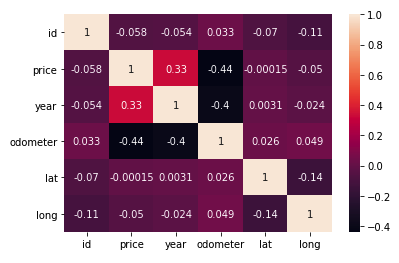
However, scatter plot cannot tell us how strong this relationship is. The solution is to calculate correlation. Figure 6 shows that the car prices have a moderate positive relation with year and a negative relation with odometer. On the contrary, latitude and longitude have a weak relation with car prices.
2) categorical vs numerical
For categorical features, we group data by category and compare them side by side using boxplot or line chart. Basically, we just divide the whole data into several groups and the following analysis is the same as we did before.
3) categorical vs categorical
Conclusion
In summary, we introduced some common data analysis techniques to gain insights from your data in this post. Hopefully it can give you an idea of how to explore data. If you’d like to explore more excellent analysis methods and visualizations, Kaggle is a great place to enhance your skills.
As for the remaining parts, we will talk about them in the following posts.
References
[1] https://www.kaggle.com/austinreese/craigslist-carstrucks-data